Recently Rated:
Stats
Guerilla Studio
I'm very slowly building a site in my spare time to put all my own stuff on and Ceri asked to re-post the post I did today on my studio set up to shoot the Lamb Argenteuil he did for St David's Day, so here's that post, from randomgaab.blogspot.com.
March 1 is Saint David's Day, the national day of Wales, and my partner and I run a Welsh-American social network site, so this date has to be a big deal for us. This year, Ceri decided we should do a recipe for Lamb Argenteuil on the site, which he liked as a special indulgence for St. David's Day in Cardiff. Ceri made it and I had to get a photo to go with his text, and this is it:

My photography "training" was mainly limited to what I needed to study multimedia, so it's all digital and heavy on fixing things in graphics programs like GIMP or Photoshop. I'm otherwise self taught and I mainly focus on images for the web, for clients' websites, for our own and for stock photo sites. I'm better with Photoshop than I am with filters and I don't have the kind of education, equipment and studio set up that an artist like Glyn Davies has.
However, I love DIY. I love figuring out how to make things myself, I love hacking an idea and figuring out how to repurpose objects. My idea of shopping is the hardware store, the thrift store and the art supply store. An unfortunate side effect is that my space is full of piles of random odds and ends and I have to argue their value, and that I am NOT a hoarder! , with other people.
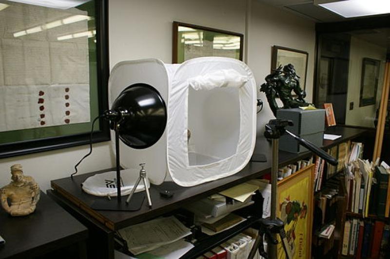
Ceri was going to make this dish for dinner, so it would be in the evening, long after good light has fled. At first, I wanted to try to make a light tent or light box, which is a cube frame with white fabric and lights outside it, the item you want to shoot is set inside, like this super cute, pop-up light tent, shot by Marc Carlson on Wikimedia Commons:
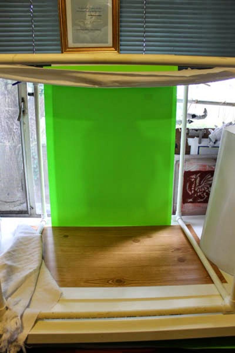
To reproduce this effect, I made a cube frame out of pvc pipe cut to 2'x 2', covered it with a white, cotton sheet from a thrift store and used three mechanic's lights with 32W CFL bulbs - one on each side and one on top. That still didn't look right and I didn't want a solid-colored background, so I built the set up, below, while Ceri was cooking:
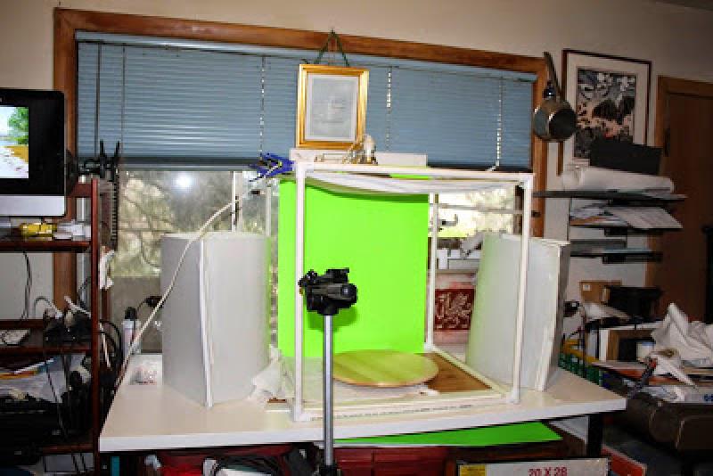
Years ago, I saw and coveted the Lowel EGO Digital Imaging, Tabletop Fluorescent Light Unit but couldn't afford to buy them, so I made my own version. Lowell lights are good and I'm sure theirs are a lot better than mine but, until I can afford them, mine will have to do. My lights are on either side of the pvc cube in the shot, above. To make them, I bent a piece of corrugated plastic (such as you would use for political signs stuck on wires in the dirt) at about a 100 degree angle. I unwound and cut a wire hanger in two halves and used the halves as braces at the top and bottom of the plastic sheet to hold it in place - poke the ends into the last hole of your corrugated plastic sheet. I used half a sheet of plastic light cover (as you'd find in a fluorescent ceiling light) bent across the front of the corrugated sheet as the diffuser in front and anchored it all with clear duct tape. Then, just cut a hole in the back and put your light socket through it. Two lights are better than one so I used a twin socket adapter like this one.
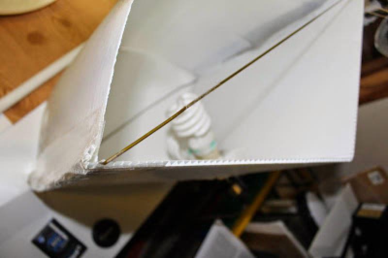
I always use CFL bulbs as they are cool and won't melt or set your diffuser on fire, if you're setting your light close or even right on top of it. I haven't tried LED lights yet, that might be even better than the CFL and, of course, those are also cool. There's probably a better material than the plastic sheet I used for the diffuser - this stuff is annoyingly brittle and prone to shattering so be careful when you're cutting and especially bending it. I used a very fine tooth jigsaw and went slow, as though I were cutting bread and I shattered two of them trying to bend it to fit my frame, so go very slow on that.
I used plastic clothespins from the dollar store to attach a square of white sheet to the top of the pvc cube frame, pulled very tight so I could put a mechanic's light right on top of it to shine down on the plate.ppI wanted something more exotic than the dark window behind my worktable so I made a cheap chroma key screen with a sheet of acid green poster board attached with spray mount to a sheet of foam board from a dollar store. This allows you to select that horrible green in GIMP or Photoshop or whatever program you're using for editing and replace it with something else. For this to work best, there can't be any shadows or any tints or shades on your background but that horrible green, so be sure to smooth it out and get rid of any wrinkles or bubbles, which is why I recommend using something like spray mount instead of glue. The "table" underneath the plate is another sheet of foam board, covered in faux wood-grain shelf liner, also from the dollar store.
If this is all too much fiddling and you're not into DIY but you still want to try some tabletop photos, Amazon has this pretty cool looking light tent and lights kit.
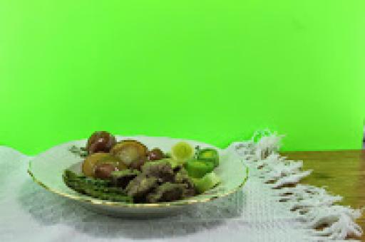
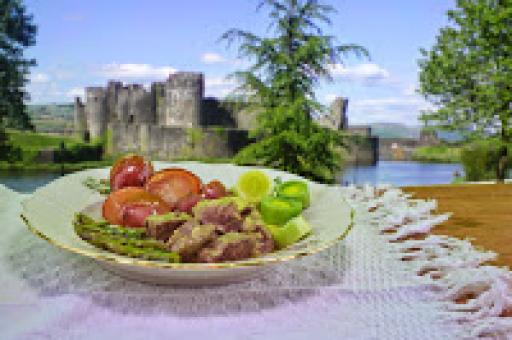
Ceri brought me the plate and it looked delicious but I knew it wouldn't come across sexy enough in the shot. There would be too much reflection of the green background, the potatoes and asparagus would be dull and matte, it really needed to be brightened up but we also had to eat it as it was thirty bucks worth of lamb, so no spraying the food with glycerin to make it look better. I covered the potatoes and asparagus in melted butter and shot fast, before it set up, and then went in to edit in Photoshop.ppThe first thing was to duplicate the original image layer - always save your original image layer untouched, applying "no pixel shall be harmed," so you have it, unaltered, if you need it. I then hid the original layer and used the magic wand tool on the duplicate layer to select and remove the background. I replaced that with a public domain image of Caerphilly Castle from wikimedia commons for the background layer, blurred with the Gaussian Blur filter. I used the blur tool on edges of the plate and the "table" where they met the background to reduce that unnatural pop-out effect.
That bright green background turned out to really adversely effect colors in the image. I adjusted hue and saturation of the meat and potatoes to reduce the reflection of the original green background and pop them out more, adding more blue and reducing the yellow. I did the same to the plate to reduce reflection of the original background in the white of the plate and lowered its saturation to further get rid of the reflection, and to reduce it as a focal point in the picture, letting the food stand out. I didn't do this to the entire image as I liked the green on the leeks, asparagus and the asparagus cream sauce on the meat, and I wanted to keep that.
I think the final version came out in sort of an early 70's cookbook style, as though the next page ought to be green olives and tuna in tomato gelatin or something. You can see the before editing on the left, and the after editing on the right.
 |
 |
If you'd like to try your hand at Lamb Argenteuil, Ceri's recipe is here .
If you like the idea of olive, tuna and tomato Jello-o salads, don't despair .

